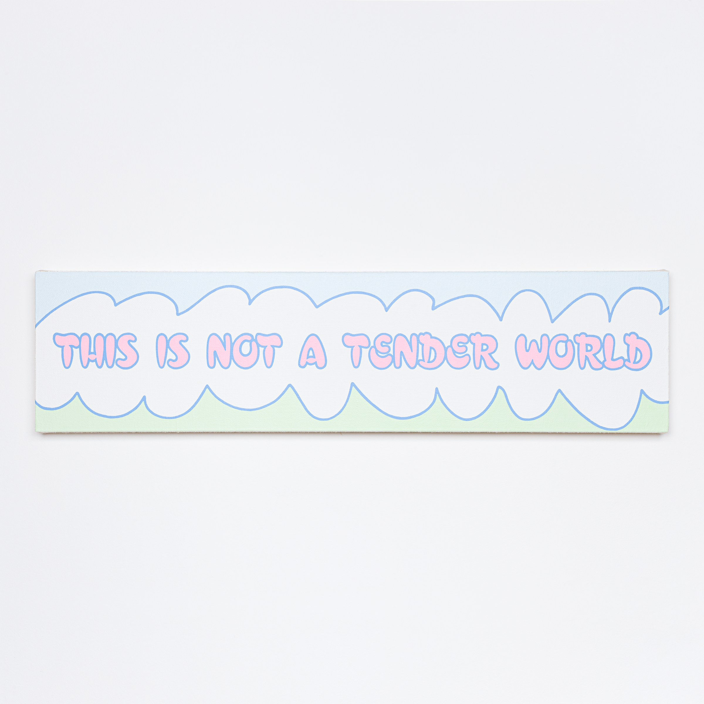
This Is Not a Tender World
2021
Acrylic on hessian canvas
31 × 124 × 5 cm
RT4A2103
Courtesy of the artist
rt4a, This Is Not a Tender World, Listen to This Is Not a Tender World on Apple Music

Audio
rt4a, This Is Not a Tender World, 2022, 02’27” ©rt4aMore +More −
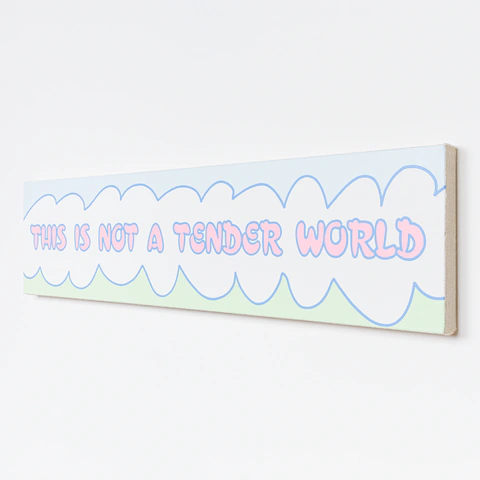


rt4a, This Is Not a Tender World, 2021, acrylic on hessian canvas, 31 × 124 × 5 cm

This Is Not a Tender World sets a hard sentence in gentle forms. The childlike aesthetic of Lily van der Stokker's work, her enlarged pastel installations, is my point of reference for that meeting of a soft visual language with a statement that resists it.
Suspended among waves of green and blue, the sentence seems almost ethereal, lost in a cloud between grassland and the expanse of an azure sky. The colours, those of innocence and childhood daydreams, are deliberately at odds with the harsh reality the sentence states.
Set in Croissant, the typeface Philip Kelly designed in 1978, the sentence calls up a bygone era. The choice of type also looks back to the first issues of Purple Prose, led by Elein Fleiss and Olivier Zahm in the 1990s.
The song of the same name, steeped in the melancholy tones of post-punk, makes the feeling of the painting audible.
More +More −


rt4a, This Is Not a Tender World, 2021

rt4a, This Is Not a Tender World, 2021